Search Daniel Colvin Art
Subscribe
Login
Share

Entries from May 13, 2007 - May 19, 2007

Saturday
May192007

The Tree Moth


treemoth1000w.jpg

The Tree Moth, archival ink jet print, 22" x 22", 2006
 

Another image from a large body of tree spirits that seem to show up in my work. I had a somewhat bland photograph of young cotton woods against a lazy sky. I played around with symmetries and got something close to this. The result was very anthropomorphic. So I then added some subtleties to bring out the human figure aspects even more. One technique I used for this was to use the liquefy brush in Photoshop to put figurative bends and curves into the tree trunks and branches. It was a rather painstaking process because you can't preview the symmetry until the liquefy mode is finished. Creating the symmetry involves flipping a copy of the image and then juxtaposing it along the edge of the original. This can be done with a hard or a soft edge. In this case I used a fairly hard edge. I remember making several attempts at the right curves and bends before I got it right.

For some reason, this image  seems to suggest a member of the insect universe, something alien with veins and wings.  Since Trees and insects have a such a complex relationship, that connection seems  right to me.  I found a geometric pattern left over from the creation of Desert Energy and used it to make the tile like tapestry on the edges.  This print feels very balanced and complete to me, and I'm very happy with it. At least one other individual seems to agree, because it sold at my last show.

Thursday
May172007

New Floral Gallery; Green Tea Chocolate

greentea-chocolate.jpg

Green Tea Chocolate, Acrylic on 300lb watercolor paper, 22.5" x 30", 2003

I hinted at its existence two entries ago, but I should formally announce a New Floral Gallery on the painting gallery page. All these pieces were painted with very wet acrylic paints on various types of 300 lb. watercolor paper in a watercolor style.  I created the texture for the table cloth in this particular piece by scraping a wide pallet knife through a wet wash of pigment, squeezing the paint back out of the paper.  This piece has an interesting color space that elicits an exotic atmosphere. Is there such a thing as green tea chocolate? There must be. I don't think its actually green though.

Wednesday
May162007

Details of Tree Telepathy

A short blog today. I'm spending a lot of time volunteering at our middle school to help paint the sets for the school play. Maybe I'll blog some images from that later.

theproofforinterstellaraborialtelepathydetail.jpg 

The Proof for Interstellar Aboriel Telepathy, detail, archival inkjet print, 22.5" x 54", 2005


This image we see today is actually a detail from a larger scroll formatted piece called The Proof for Interstellar Aboriel Telepathy.  ( don't forget you can click again on the image in the gallery to get the light table mode) This has to be on of my most long winded titles. Long titles put a strain on data management systems and this piece often gets shortened to Tree Telepathy or something like that. But its important to understand it as a proof in the mathematical sense. A proof written in a math so foreign to hour human minds  that it ends up looking to us like Surreal Art.

Monday
May142007

Variations on a Theme; Painting Quasi Triptychs

coolskywarmearthtriptych.jpg
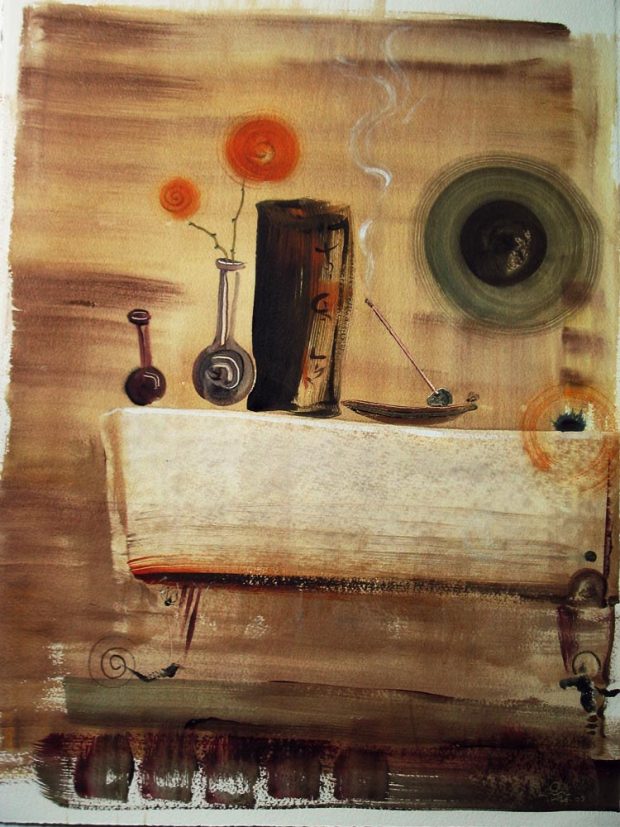
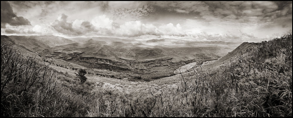
Cool Sky, Warm Earth, variations 1, 2, 3, each 22.5"  x 30 " Acrylic on waterford 300lb paper, 2003.
 

(There are  larger versions of these pantings at this gallery)

Sometimes when I paint, I'll set up three easels with surfaces the same size and then use the same pallet to paint the same basic composition. I started doing this because of acrylic paint. I would load up the pallet with lots of wonderful paint and then have to throw so much out because acrylics just dry to fast to make saving them overnight practical.  Tired of wasting so much paint, I figured why not paint three at once! It was just a whim at first, but I soon became fascinated with the process.

This strategy caused me to hesitate because I feared  I would end up repeating myself. How wrong I was. Even if I tried really hard to repeat myself, it seemed almost impossible. What I did find was that I was able to get wonderful variations on a theme. This process generates results that  remind me of musical variations in jazz or Bach.  Essentially you lock down some of the  elements of the art and let the other vary.  With these paintings, I have locked down the size and aspect ratio of the surface;  the colors being used; and the subject matter.  That leaves  the placement and shape of the objects in the composition.


I should back up here and discuss the way I  work in this type  of painting. I actuality have a fairly improvisational style. I sometimes do not know what I'm going to paint until I put the first mark down. I then let that stroke inform the next, and so on, until the basic subject matter and treatment emerges. At some point I shift to a refining stage where I try to improve the expression of what's emerged, and this is largely technical exercise. I usually do the first phase in one day and then the  refinement over another day or two.  Now given this improvisational style,  and the variation strategy described above, we have a situation where the 'first stroke' on each piece will be different even if I try to make it the same, which I do not. This means that for each painting  the  sequence of  strokes will immediately begin to head in different directions.  The final pieces, though following essentially the same 'road map', end up looking pleasingly different.

Also consider that these are water media, Acrylics being water based . My use of water here is heavy, more like watercolor than oil painting. When working wet into wet the water behaves randomly in an almost mystical way. The chaotic way the pigments drip and blend  in the ground of the sky for instance, could not possibly be repeatable. So in some way, the vibrations of the cosmos dictate the direction each painting will go. I know that  sounds pretty Woo Woo, but it does cause one to think. When I  sit down to paint just one painting, instead of three, what small seed in the environment will change the course of  the work, a gust of wind or the bark of a dog could end up changing the size of the sun. 

I don't consider these to be a formal triptych. For me a triptych would probably mean having a single composition run across three separate surfaces. In case your wondering, I don't have favorites. I suppose its like your children, you love them equally, flaws and all, they're just different. If I was asked to put just one in a show? I would hope someone would have curatorial input for me. On that note, why not make a comment below and tell me if you have a favorite and why?

Sunday
May132007

Waimea Canyon: Talk about the edges

I took this image of lower Waimea Canyon, on the island of Kaua'i, in Hawaii.

 Lower-Waiamea.jpg

The Waimea river starts in the tropical rainforest at the top of the island and then cuts down through the calderas and slopes of the volcanic peak, carving a path toward the sea and the dry side of the island. As you drive up the road you see a progression from dry scrub lands to lush rainforest. This Panorama was taken near the bottom where the climate is much drier. But you can see the Jungle clad mountains in the B.G.

This has been a challenging  print for me because the feeling of the day, with the cloud shadows had so much depth and was   very dramatic. I'm not sure this B&W print is getting all that across. But today I want to share some thoughts on borders for photography, particularly the panoramas. I am still forming my philosophy around this so please comment below with your own opinions and help me clarify my own thinking. The first version you see here has no borders at all just a straight crop.

 Lower-Waiamea-Comp.jpg

This version however displays the latent edges of the original strip up for the panorama. I like it for two reasons. First it communicates a truth about the image that is otherwise quite hidden––that the print was created from multiple shots from the camera. I like giving hints about process in the art. Secondly, its a form of deconstruction to show the ragged edge like this, and adds a visual interest that takes the piece beyond the traditional photographic print. This type of edge creates a self-reflexive quality in the media itself  by calling our attention to the transition from the pure experience of the image to the physical elements of the paper and frame, commenting on and revealing the illusory aspect of  the photograph.

Then again, I often find myself disliking the ragged 'real' border for the same reasons, it can take the attention away from the image  and distance the viewer from the pure experience of the landscape itself. So perhaps the tension between these two paths can be described as: commentary on process vs. Purity of statement.  If you look at the finished prints of my panoramas in mass you'll see that I go either way on this question, leaving it to a gut decision for each particular case.

Lower-Waiame-blkBorder.jpg 


A third option is to add a matt type border, such as this black one. This question is more simple to me. I tend to use the black border when the edge of the photograph itself does not separate well from the matt or background it is presented against. Images that have big swaths of white in them fall into this category. It should be noted that this is separate from the  black border created when you show the exposure edge of the processed film itself.

 drift-wood-tree-root.jpg

This is often done by photographers when they want to show that they are composing in camera, as opposed to cropping in the printing phase. I don't care that much to show off my in camera cropping abilities which are often not all that effective.  However I will sometimes leave this type of black border on for the same reason as I might add an artificial one, to clarify the edge of the composition.