Search Daniel Colvin Art
Subscribe
Login
Share

Entries from April 29, 2007 - May 5, 2007

Saturday
May052007

Balance Rock Art

 nooksack-river-balance-rock.jpg

This is my photograph of a balance rock I did last summer during our family vacation at our NookSack river campground near Mt. Baker. (as far as a finished photo print, its a work in progress) I find making rock balance towers a very zen and pleasing chalange.  I also have a theory that any naturally balanced configuration of mass, will generate a pleasing balance of form.  Since almost every balance tower I've made seems to follow this rule I'm inclined to think its true. Any mathmaticians out there want to try and offer a proof? Maybe I'll post a gallery of the balance rock images later.

Friday
May042007

River Sylph Painting


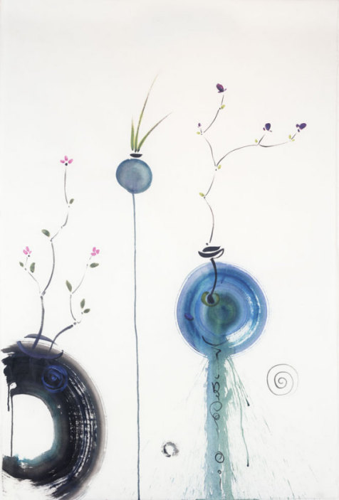
This painting represents an interesting hybrid of the Sumi style with something that is somehow quite modern and western  to me ( as in western-civ). Happily this piece sold almost right away, but I kind of miss it.

RiverSylph2.jpg

When I look at it now, I see a number of influences––impressionism, Russian Folklore, Sumi Brushstroke, Expressionistic Color. I also really like the way the shape of  the nude is mostly created by the absence of paint.  In fact the main shape of the torso was created by one broad scrape of a large pallet knife. I had just laid down the initial wash and immediately pressed the blade over the paper––literally squeezing most of the pigment back out of the paper. I was experimenting at the time with  painting on printmaking paper. Because print paper is designed to take ink under pressure, it has a very different sizing than watercolor paper. Its much more repellent of moisture and the paint tends to sit on the surface. Then when the lithographic press squeezes it  the ink gets pressed into the paper. Something about this type of paper made it very amicable to the hard scrape of the pallet knife.

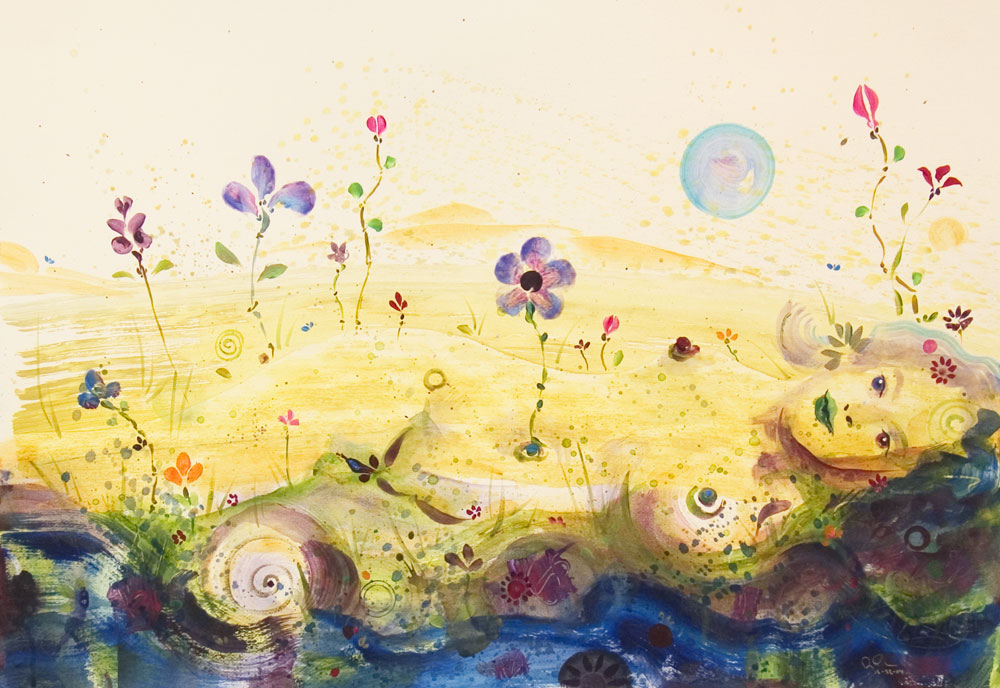
The composition works subtly in that the suggestion of female form is almost entirely derived from this one stroke. Besides the face and shading that forms the line of the jaw, almost all the other details that suggest female form could easily be floral or other garden elements. In this way the body is suggested by the absence of paint. Put your hand over the right third of the composition to get a stronger idea of how this works. Perhaps this only works because, being human, we are progamed to recognize our own form when it appears around us. This painting started out as a floral landscape with no intent at a figurative component. But as soon as I made that first scrape I knew where it had to go.

The piece was pretty much finished after the first session, but I set it aside and came back the next morning and added the vague suggestion of hills in the far background. (these shapes are also intended to be quasi figurative). I also added the dark blue and maroon tones at the very bottom, trying to emphasize the idea of a stream or river bank. These dark tones anchor the piece and are crucial to it's success.

The imagery is partially inspired by Slavic and ancient Greek mythology. In Slavic folklore the Rusalka function like the ancient Greek water nymph, presenting a alluring and sometimes dangerous temptations. But more interesting for me, they also represent an anthropomorphic perception of nature. personification of the nature spirit provides a mechanism for putting a stronger emphasis on the importance we give towards the natural world. If a stream in the woods we like to hike to moves us, then representing the 'essence' of that stream with a beautiful human figure communicates very strongly the beauty meaning, and perhaps intelligence, we feel about natural place.

Thursday
May032007

Recent Sumi Art

I'm also adding the Sumi Art Gallery to show some of Sumi styled work I've done in the last few years.

Inkwell-Detail.jpg

Inkwell's Lilac Nose, Detail , 2006, Acrylic Paint and Sumi ink on mulberry paper


I love the immediacy and energy that abounds in painting in this style. The pieces happen very quickly and I don't always have a very specific plan for where I'm going with the images. I'll make a few strokes and find that a floral piece suddenly wants to become a nude or vice versa.

Thursday
May032007

Ruby Beach Gallery

Since I've been talking about Ruby Beach, I've added a gallery of images I've taken there. You'll find mostly photography in this gallery. In honor of the new gallery I decided to work further on more recent project, which is pictured here, Ruby Beach Creek.

 rubycreekbeach.jpg

This has been a problem print for me and I continue to hammer on it. I'm half satisfied with the version you see here. It is a stitch up of three images taken from the south side of the lagoon behind the beach. Usually I try and stitch up from a standard format lens, because the distortions are not as difficult to match, but in this case I used my 40mm Hasselblad lens which is quite wide, maybe the equivalent of an  18 or 20 in 35mm format. The weather was gray this day and there is a very high dynamic range between the sky and the shadows under the drift wood logs. (click on the image and then click on it again to get a larger view. On this website you can usually go two layers deep with clicks to give you larger images) 

I've found a way to trick my scanner by scanning my negatives as positives. For some reason this enables me to get a histogram where all the tones are represented with out any clipping. I then invert the scanned image in Photoshop. Since I always scan to 16bit files I have a lot of data to play with in resolving the tones. But the initial look is not what you would expect to see in a black and white print. I personally find it difficult to conceptualize my way back to the proper gamma curve for a good print.

Tuesday
May012007

Ruby Beach Dream

Click on this link to get an in-depth description of the technical and aesthetic process I went through to make this image. Lots of pictures to see along the way

RubyBeachdream300w.jpg 

Ruby Beach Dream, archival Ink jet print ,46" x 30"


Tuesday
May012007

Back to Sumi Painting

The last Daniel Colvin Fine Art invitation I sent out contained this image, Iridescent Ikebana painted on mulberry paper with Sumi Ink and Acrylic Pigments. I am beginning to arrange the studio to do more of this work on Asian Paper. Hopefully, if the weather is nice, I can paint outside, where I feel free to really splatter and swish the paint around. I've developed a style where I can use modern pigments, including metallic and iridescent colors and paint in this ancient style. The iridescent pigments are mostly lost on the computer screen so its an extra treat to see the original paintings and all the rich depth of color that exists there. I love this kind of painting because its very immediate and dramatic to do. check back in a week to see the first results.

IridescentIkibana.jpg
Iridescent Ikebana by Daniel Colvin  Sumi ink and Acrylic on  Mulberry paper, 2005,  24" x39"


 Ikebana  refers to Japanese flower arranging and I'm often inspired to make 2d versions of this on paper. Or at least when I look at the result of some of my Sumi style still life's, I think of Ikebana. By the way, this original painting is still available for purchase. I hope to have a gallery of my Sumi Paintings up soon.

Tuesday
May012007

Invitation for Art Show

I volunteered to do the invite for my daughters first grade Art Show. I used the same design style I use for my own invites and used a piece of my daughters art instead. I also mixed up the fonts a bit. Here's where I ended up.

FirstGradeArtInvite3.jpg