Waimea Canyon: Talk about the edges
 Sunday, May 13, 2007 at 11:13AM
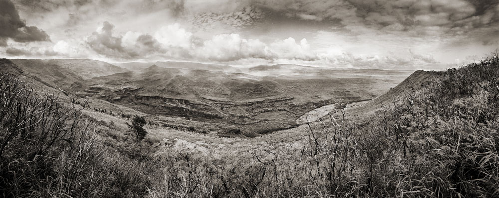
 I took this image of lower Waimea Canyon, on the island of Kaua'i, in Hawaii.

The Waimea river starts in the tropical rainforest at the top of the island and then cuts down through the calderas and slopes of the volcanic peak, carving a path toward the sea and the dry side of the island. As you drive up the road you see a progression from dry scrub lands to lush rainforest. This Panorama was taken near the bottom where the climate is much drier. But you can see the Jungle clad mountains in the B.G.
This has been a challenging print for me because the feeling of the day, with the cloud shadows had so much depth and was very dramatic. I'm not sure this B&W print is getting all that across. But today I want to share some thoughts on borders for photography, particularly the panoramas. I am still forming my philosophy around this so please comment below with your own opinions and help me clarify my own thinking. The first version you see here has no borders at all just a straight crop.

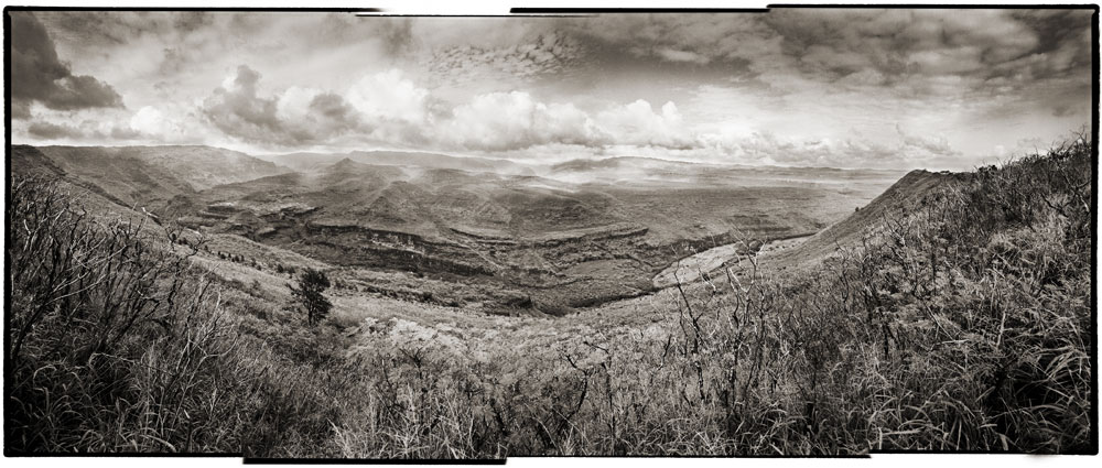
This version however displays the latent edges of the original strip up for the panorama. I like it for two reasons. First it communicates a truth about the image that is otherwise quite hidden––that the print was created from multiple shots from the camera. I like giving hints about process in the art. Secondly, its a form of deconstruction to show the ragged edge like this, and adds a visual interest that takes the piece beyond the traditional photographic print. This type of edge creates a self-reflexive quality in the media itself by calling our attention to the transition from the pure experience of the image to the physical elements of the paper and frame, commenting on and revealing the illusory aspect of the photograph.
Then again, I often find myself disliking the ragged 'real' border for the same reasons, it can take the attention away from the image and distance the viewer from the pure experience of the landscape itself. So perhaps the tension between these two paths can be described as: commentary on process vs. Purity of statement. If you look at the finished prints of my panoramas in mass you'll see that I go either way on this question, leaving it to a gut decision for each particular case.

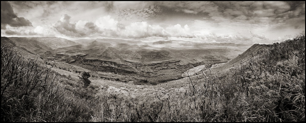
A third option is to add a matt type border, such as this black one. This question is more simple to me. I tend to use the black border when the edge of the photograph itself does not separate well from the matt or background it is presented against. Images that have big swaths of white in them fall into this category. It should be noted that this is separate from the black border created when you show the exposure edge of the processed film itself.
This is often done by photographers when they want to show that they are composing in camera, as opposed to cropping in the printing phase. I don't care that much to show off my in camera cropping abilities which are often not all that effective. However I will sometimes leave this type of black border on for the same reason as I might add an artificial one, to clarify the edge of the composition.

Reader Comments