Search Daniel Colvin Art
Subscribe
Login
Share
Thursday
May102007

Patrick's Point • Surprise Valley

Two Photographic Landscapes: The Mystery Connection

Two more images from the summer 2006 road trip. There is a connection between them, can any body tell me what it is?

suprisevalleynorthproof.jpg

I took this photograph at   the upper end of Surprise Valley in extreame North East California; It is the last image taken on that day. Earlier, I had been driving north on 395 and decided to explore the next valley east and followed 299 across the Warner Mountains to a sort of lost world in the form of Surprise valley. This humble desert basin boasts big alfalfa production  and Cedarville had a sort of budding art colony feeling. I followed a road that headed north along the shore  of Upper Lake and passed  through declining towns and abandoned farms shrouded in vines and trees, the bare wood striped of paint by the wind but preserved in the dry air. I'm still kicking myself for not stopping to take a picture, which is probably why these haunted structures still haunt my imagination. But of course if I had stopped, then my timing for the evening would have been altered and I would not have been able to take the picture you see in this blog, at this precise moment. By the time I would have arrived at this spot,  darkness would have fallen, the rainstorm long since passed on unseen. Fate is a strange mistress.

The Warner mountains provide snow melt and water shed to the lake which, I believe evaporates all its moisture to the desert. By the time I reached the location for this picture the last gasp of day light was playing off this distant rainstorm. As so often happens in the desert, you can see the rain falling but not get any near you. I remember when I took the picture feeling the image was a little flat but knew I would be able to pull out the latent drama in the scene. Very happy with how this one turned out. I'll have to go back some day and get images of those abandoned farmhouses.

patrick-point-cove.jpg 

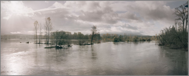
Next we'll head west  to Patrick's Point on the California Coast. I  took this one while headed south about a week earlier. The pictures that made up this panorama were some of the first taken of the day.  I was driving south on 101 before sunrise and saw a sign for 'Patrick's point', a dull looking road like hundreds of others you see on the interstate. I almost drove right past but decided to check it out. Wow, these coastal headlands form  a beautiful seaside landscape. I grabbed several Panoramas on this rather pristine and peaceful morning.

If you figure out the connection between these two images, post a comment and let me know. 


Wednesday
May092007

Digital Alchemy Galleries Added

I've just updated the site with three new galleries, all focusing on a style of graphic work I call Digital Alchemy. In my mind I've divided the work between old and new, vertical and horizontal. The later because it makes a more pleasing viewing experience when you page through one image at a time. This has always been a challenge, especially with the tall vertical format I seem to like. I call them scrolls because they remind me of the long vertical scrolls you see in Asian art.

 novembertropic.jpg

November Tropic, 1998, Archival Ink Jet print


What is digital Alchemy? Well that's a big question. Essentially it's a name I came up with  in 1998  to describe this new genre of work I had started to explore. I was taking traditional photography, graphic work from my commercial (and mostly digital) work, as well as pieces of drawings and paintings, and combining them all together in multi layered files and then printing them out with archival ink jet printers. At first I used the iris, then switched to Epson.


For an in depth description of Digital Alchemy, click here and you'll find a copy of the Artist Statement I wrote for my first Solo Gallery Show at the pearl gallery in Portland.

Monday
May072007

New Digital Alchemy

I've been working on setting up a Digital Alchemy Gallery on this site. I was going to say that I no longer work in this idiom when I realized that I've actually got several new works that clearly fall into the category. Its strange how our minds can create false ideas about how we define ourselves and our work. As of this post, this piece is now called Diary of a Root Sprite. We'll see if that sticks. It is essentially done, perhaps a few minor tweaks, but nothing that could be noticed on the web will change. (The piece is 25" wide and 75" tall)entanglementrootweb.jpg

This particular piece results from several images acquired on  the summer 2006 road trip. As I motored  north on   US  395 , making the return loop, I got close to the Oregon Border where I spotted this scruffy tree along side the road––a Pinyon pine I think. I always keep my eyes out for trees that have good separation from there environment.

In photography, separation of the subject matter from the background can be very important, especially with trees. Most trees stand near other trees and the fractal complexity of the branches blend the edges of one tree to another and make it very hard to 'see' a clear image of the subject.  In everyday life our 3D binocular vision solves this problem for us and allows us to appreciate a single tree in a forest. But in the 2D world of photography this is not possible. This is why so many images taken in forests are disappointing. You usually need to be thinking about separation when photographing in nature.  A lone tree on top of a hill is the best possible separation of all and this was the case here.

 I combined this image with another image I made under a tight windblown spruce forest along the Oregon coast--an image so tangled with dead branches that it reminded me of roots in an underworld hollow.  The final element is from a scan of a painting I did some years ago, Acrylic on Panel. I scanned it at various stages and this was from the halfway point. I then took half of the face on this painting and flipped it so that a new face appeared, a face strangely inhuman due to the symmetry (most human faces are somewhat unsymmetrical and nothing makes someone look a little odd like doing a mirror flip on their face and making them perfectly symmetrical. Try this out and compare a left side flip with a right side flip. One person can sometimes look like two siblings rather than a single individual. Click here to a get a page that further describes the process behind the Root Sprite. You see, it already has a different title. I'll have to blog on the subject of titles soon.

Sunday
May062007

Two Photographic Panoramas

Today I'm sharing two panoramas  from recent work in progress. First a panorama taken from  at the  height of the record breaking flood we had on the Snoqualmie river. This was taken from the deck of Tolt bridge, which was closed to auto traffic ( I crossed the 'danger' striped yellow tape to get the shot)

snoqualimeflood.jpg 

 This second one has a working title of Clear Cut Panorama, not the most original title I'm afraid. I'll have to think about changing that.

clear-cut-panorama.jpg

This image seems to play two chords at once. On one level the view plucks a note of regret for the destruction of  a natural habitat. But simultaneously we recognize a beautiful moment in the day cycle of nature––warm tones and the bright  wash of fresh growth.  The clear light of morning and the abundant grasslands of summer thriving in the tombstone stumps of the harvested trees create an atmosphere of ambivalence. Is this image beautiful or ugly or both? This tension interests me as an artist. It would be even more interesting to have a juxtaposition between this image and another made the day after the loggers blasted through. Perhaps even a third image taken in twenty years. Even the trees still standing in the background of this image  are probably only forty to fifty years old, a far cry from the giant spruces and furs that once covered this land. As a modern human I accept that we have to harvest some timber from the earth, But I do hope that we can let great tracts of our forests return to the magnificent state of old growth forest. 


I took this image last summer while driving down the pacific coast from Seattle to San Francisco. I found this landscape where highway 101 takes a jog inland and goes through the coastal range that sits between Oregon's Willamette valley and the rugged sea shore. I apparently made the trip at the height of the camping season, for every campground I came across displayed the dreaded 'Campground Full' sign. I was driving the new family minivan and had all the seats out so I could sleep in the back and was determined to sleep for free out in the fresh air rather than pay for a  stuffy motel rooms.  It was dark when I drove up an old logging road and took the least maintained fork in the road several times until I found a flat stretch of isolated dirt track where I could park the van on level ground off to the side. I slept well to the sound of crickets and crisp coastal mountain air. The next morning I awoke to birdsong before sunrise and headed back to the main road. On the way back to the main highway, the vague shadows I had seen off to the side of the road the night before were transformed to a real forest. I came across a side road that headed out into a fairly recent clear cut .I decided to follow the road, hoping that I would find a nice spot for a landscape composition. My road ended on a little bluff where I took this image just as the sun was rising.

Tech talk: This composition is compiled from 4 2.25 color negatives shot with the Hasselblad, probably on the 80mm lens, a really good focal length for stitching panoramas. I chose color neg because I knew the dynamic range would be brutal. There's got to be at least 12 stops between the  detail on the carbonized tree stumps and the brightest highlights on the clouds getting the first sun of the day. Color Reversal film would have forced me to choose one of these two place to have detail, not both.  As it was, I struggled to get an image that did justice to both of these zones.  I think modern Color neg can resolve  a ratio of 9 to 1  gray tone to  gray tone. So if I expose the blackened stumps to be just at the darkest gray, almost black, that  also gets me just a light-light gray just a bit   below white detail on the clouds. This is on the negative of course, the contact sheet I get back with the processed film will not resolve this much information. I need to get the information off the negative in the scan. Once I've resolved the tonalities to my satisfaction, I then embark upon a complicated process of color correcting, including some tricks I've developed in Photoshop for removing the annoying cast of color-neg film. I hope to post a page in the future showing that process as well.


Saturday
May052007

Balance Rock Art

 nooksack-river-balance-rock.jpg

This is my photograph of a balance rock I did last summer during our family vacation at our NookSack river campground near Mt. Baker. (as far as a finished photo print, its a work in progress) I find making rock balance towers a very zen and pleasing chalange.  I also have a theory that any naturally balanced configuration of mass, will generate a pleasing balance of form.  Since almost every balance tower I've made seems to follow this rule I'm inclined to think its true. Any mathmaticians out there want to try and offer a proof? Maybe I'll post a gallery of the balance rock images later.

Friday
May042007

River Sylph Painting


This painting represents an interesting hybrid of the Sumi style with something that is somehow quite modern and western  to me ( as in western-civ). Happily this piece sold almost right away, but I kind of miss it.

RiverSylph2.jpg

When I look at it now, I see a number of influences––impressionism, Russian Folklore, Sumi Brushstroke, Expressionistic Color. I also really like the way the shape of  the nude is mostly created by the absence of paint.  In fact the main shape of the torso was created by one broad scrape of a large pallet knife. I had just laid down the initial wash and immediately pressed the blade over the paper––literally squeezing most of the pigment back out of the paper. I was experimenting at the time with  painting on printmaking paper. Because print paper is designed to take ink under pressure, it has a very different sizing than watercolor paper. Its much more repellent of moisture and the paint tends to sit on the surface. Then when the lithographic press squeezes it  the ink gets pressed into the paper. Something about this type of paper made it very amicable to the hard scrape of the pallet knife.

The composition works subtly in that the suggestion of female form is almost entirely derived from this one stroke. Besides the face and shading that forms the line of the jaw, almost all the other details that suggest female form could easily be floral or other garden elements. In this way the body is suggested by the absence of paint. Put your hand over the right third of the composition to get a stronger idea of how this works. Perhaps this only works because, being human, we are progamed to recognize our own form when it appears around us. This painting started out as a floral landscape with no intent at a figurative component. But as soon as I made that first scrape I knew where it had to go.

The piece was pretty much finished after the first session, but I set it aside and came back the next morning and added the vague suggestion of hills in the far background. (these shapes are also intended to be quasi figurative). I also added the dark blue and maroon tones at the very bottom, trying to emphasize the idea of a stream or river bank. These dark tones anchor the piece and are crucial to it's success.

The imagery is partially inspired by Slavic and ancient Greek mythology. In Slavic folklore the Rusalka function like the ancient Greek water nymph, presenting a alluring and sometimes dangerous temptations. But more interesting for me, they also represent an anthropomorphic perception of nature. personification of the nature spirit provides a mechanism for putting a stronger emphasis on the importance we give towards the natural world. If a stream in the woods we like to hike to moves us, then representing the 'essence' of that stream with a beautiful human figure communicates very strongly the beauty meaning, and perhaps intelligence, we feel about natural place.

Thursday
May032007

Recent Sumi Art

I'm also adding the Sumi Art Gallery to show some of Sumi styled work I've done in the last few years.

Inkwell-Detail.jpg

Inkwell's Lilac Nose, Detail , 2006, Acrylic Paint and Sumi ink on mulberry paper


I love the immediacy and energy that abounds in painting in this style. The pieces happen very quickly and I don't always have a very specific plan for where I'm going with the images. I'll make a few strokes and find that a floral piece suddenly wants to become a nude or vice versa.