Ruby Beach Dream
Ruby Beach Dream, archival Ink jet print ,46" x 30"
On This Page I'm going to try and take you down the creative path that led to the image Ruby Beach Dream
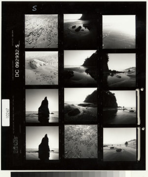 I probably took the original images with Hasselblad circa 1998. I remember a brilliant day in august where the air was soft and the late afternoon light hung golden over the beach where I played Frisbee with my family between sessions with the camera. When I got the film back I scanned the contact sheets and used the small images from that file to play with various compositions. The two on the lower left that are marked caught my eye for a possible panorama. (I'm actually excited because in building this page I noticed a few images on this contact sheet that I have not printed yet and would like to try playing with.)
In searching through my archives I found this image I made from these contact sheet scans. As you can see I took some liberties with geography of the environment, something I have no compunction about doing if it strikes me as an aesthetically sound idea. 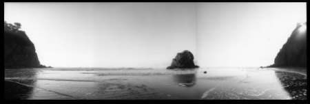 This flies in the face of some old stalwarts of traditional landscape photography, but that's not me! I'm not sure what my intention was with this image but I suspect its an alternate composition to the one I ended up with. Perhaps I'll try and create a polished version of this someday.

click to see the trouble maker
2.25" panchromatic negative) On a humorous note I remember on this particular day that for about a half an hour this strange gentleman seemed to place himself in front of my camera, no matter where I aimed. I did not know if he was doing this on purpose or if it was just my bad luck.
Fortunately digital technology allows for the clean removal of such individuals, so the last laugh was on me. After some careful stiching and clean up, I ended up with this image:
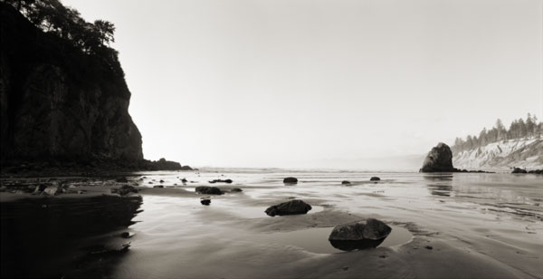
You'll notice I decided to add a tint. This is something I do with black and white prints quite often. Not only do I find it aesthetically pleasing but at the time I made this it was much harder to generate truly neutral gray ink jet prints and adding a tone you choose is much better than struggling with one you don't want.
I actually really like this image as a traditional Monochromatic Landscape image in the classic sense.
Temple at the Edge of the World I've published this and sell prints in this form. However, the muse kept whispering in my ear and I felt compelled to take it in the direction of my other Digital Alchemy Prints.
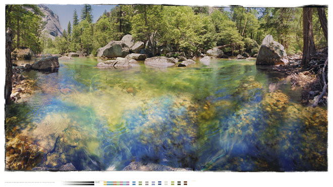
I had just finished another Black and White Digital Alchemy piece called Temple at the Edge of the World and I wanted to have a companion piece in the same aspect ratio. But I knew I needed some other material to fill out the composition so I looked through archives and found Cool Cool Waters, which is in vivid color. Hmmmm, I thought, maybe this piece would merge well with the wet sand and tidal pools in the foreground.
Cool Cool Waters was a successful print I had made of six 2.25 images taken on the Merced River in Yosimite National Park and it had sold fairly well. But I did not think that this use of the the imagery as part of a Black and White Digital Alchemy piece would dilute the power of the original. Actually I like to have connective 'threads' that link my work together as it starts to create a larger narrative out of the whole body of work.
Once I flushed out the aspect ratio it was time to go to town with the digital collage process. I started by pulling various images that intrigued me from my archives and pooling them together in a folder to consider. I use
click on image to see larger view i-view media pro to archive my images and I set it to thumbnail mode and just start flowing through, letting the images give me ideas. I now have almost 8000 images in my archive and its amazing how being able to browse through them helps me think of ideas I would never get if I didn't have the visual reference. This is an essential tool for my work. here are a few of the images I came up with that stayed in the composition. (Many go in and then come right out again!)

dragonfly flat bed scan
arch way in Orvieto Italy

Masks are created and the images are carefully placed in layers of the working file.
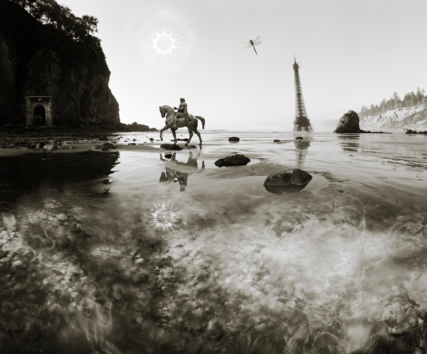
Now check out these detail frames from the final image. (you can click on these images to see larger versions) The Eiffel Tower image gets a treatment I've used  several times in my work, i.e. taking a famous landmark and placing it in a surprising situation/location. This type of juxtaposition is key element of surrealism. (Surrealism informs the Digital Alchemy Series quite heavily ) I have a vivid memory from 1968 when I was ten years old and I first saw Planet of the Apes at the newly opened Palo Alto Square Cinema. The part where the female crew member's body was mummified scared the bejeezus out of me, but the image that stuck with me was from the end of the film when Charelton Heaston stumbles upon the half buried Statue of Liberty and he realizes that he's actually
  been on earth for the entire film. The dissonance and frisson of this juxtaposition suggests the vast passage of time. A beach always look like a beach, but the crooked Eiffel Tower tells you much more might be going on. I remember placing the Eiffel Tower into the waves took a great deal of care in order to make it look believable. I think this Eiffel Tower would be about 4 times the size of the real one, but this placement works in the image. In both these detail shots you can see that reflection has to be finessed on the ground in the area before the inserted layer. The wetter the sand, the more it acts like a mirror while the the dryer sand has no reflective quality at all. If the object is closer, as with the equestrian statue, there is some diffuse shadow effect as well.
Believe it or not, I'm still finessing this image. I thought it was done, but when I added it to the slide show in the extra features on Atlas Dei, I felt the horse would work better further up in the composition. I remember reading about famous painters who could never stop 'touching up' their work, even bringing their paint kits to houses of people who had purchased their paintings. Perhaps there is a little of that in me, but I have a slightly different take on the digital prints. I used to feel strongly compelled strive for an image that felt 'finished' and then walk away and consider no more. But to my way of thinking one of the aspects the digital process is that invites a different approach. Why should anything be considered finished? I'm often printing out pieces for sales that I first printed over seven years ago. Since that first printing my editing skills have improved and so as technology. But more important my sensibilities might have changed. When this happens I make a decision. If the change is minor, I make it but don't acknowledge it formally , if the changes is significant then I let the work bifurcate and give it a different name. I'll have to think about what level of significance moving the horse entails. Perhaps I should name pieces like this with a date, so they have a vintage like fine wine. ( As far as technical changes, an analog situation in the analog world, would be the decision by Ansel Adams to reprint some of his most famous negatives from the twenties and thirties when the printing technology improved in the fifties and sixties. The newer prints are technically 'better' but the older prints are worth more to collectors due to scarcity.)
So perhaps I'll call this one Ruby Beach Dream 2007.