Photography or what?
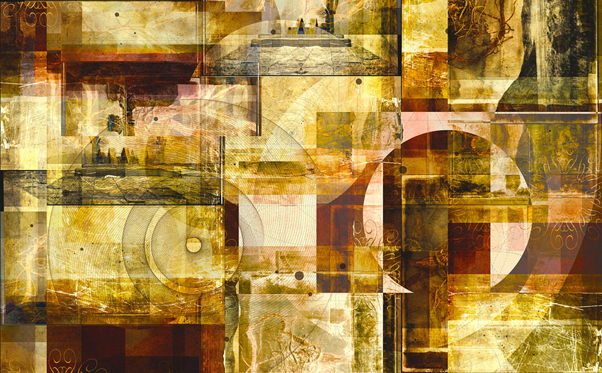
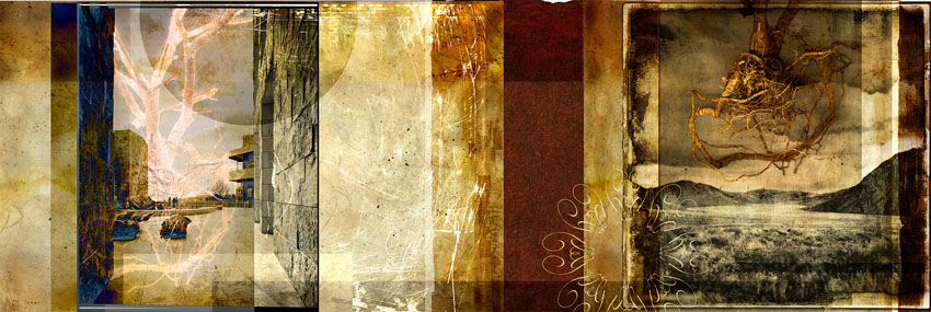
Remixer Two, Ink jet print, 36" by 65", 2008
Where does an image stop becoming a fine art photograph and start becoming a piece of graphic fine art?
Or I could ask, How do we get
from here,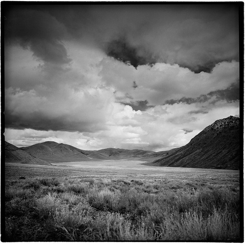
Darkland, 20 x 20, inkjet print, 2008
to here? 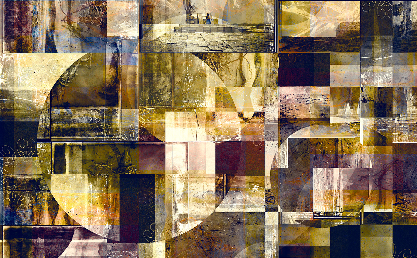
I'll try and explain!
 Often when I'm working with post processing phase of photography, I begin to adhere to what I call the Cult of the Antique, and begin adding faux self-reflexive elements from old photographic processes that mimic noise and grunge of the analogue world.
I do this because it helps, in my opinion, combat the sterile perfection of the digital world that seems to surround us more and more each day.
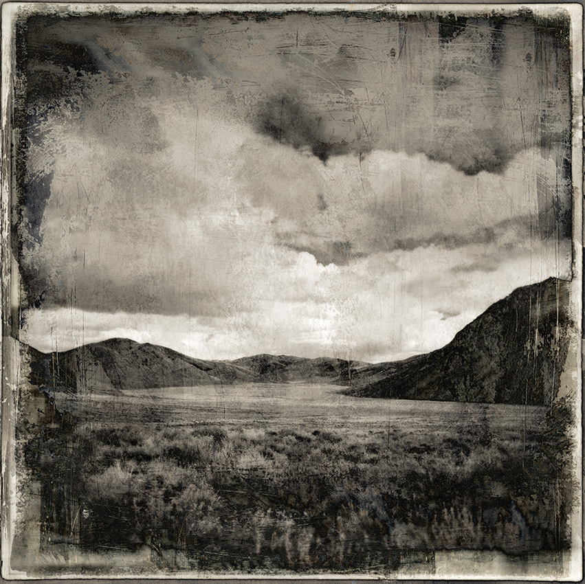
Darkland with Grunge, 20 x 20, inkjet print, 2008
And so while I embrace digital tools as merrily as child in the proverbial candy store, I sometimes temper these powerful processes with things that make the image feel more 'real' ,or at least, effected by the causality of real world forces, such as time, wear and tare, and dirt.
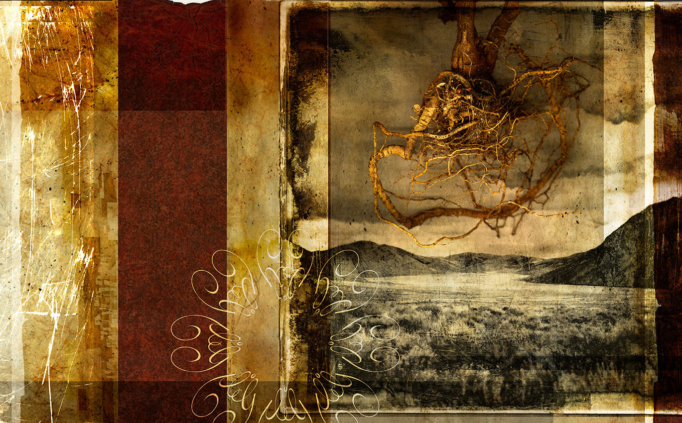
Often when doing this I'll start to get ideas about graphic design and other manipulations that go beyond the normal photographic idiom. In this case Darkland with Grunge became a foundation element for Traverse. After adding the wonderful 'grunge' to Darkland, I proceeded to embed it even further into a varieties of textures and graphic elements, which, when combined with another image taken at the Getty Museum in L.A., became this wide format work of art I call Traverse. Here is the point I believe the work of art stopped being just a photograph:
Traverse, Inkjet print, 20"x 62" 2008
(To see a larger version where you can scroll around on this go here. ) I like this piece, I really do, but I also see the wide aspect ratio as a possible liability in terms of display. So I tried making it into two pieces that could be displayed together in separate frames, the right hand version looking like this:
So, at this point, I became curious what would happen if I kept folding and manipulating the image. I broke the wider version of Traverse up into three overlapping files, rotated each of them into a vertical position. Then I sectioned them off in areas roughly approximated by the golden mean and flipped those sections in the horizontal and vertical. Next, I combined all three together in the same file, and added several more flips and then some circles. The circle elements were done by selecting a round section of the image rotating it 90 degrees. Other areas had their density and gamma adjusted to steer the eye in the proper directions and then the color was manipulated as a last touch. in this case the whites were pushed towards yellow and the blacks were given a purplish tonality. And now we have entered, I think into the land of true abstraction.
Remixer One, Ink jet print, 36" by 65", 2008
Remixer Two, is mostly a variation on this same process, with some more graphic overlays added on top. Hope you enjoyed this description of my journey from specific image to abstract imagery.